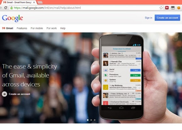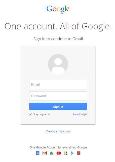
When you click "sign in", Google sends you to the new minimalist sign-in page. It looks just like the mobile sign-in page and it no longer includes information about Gmail. Maybe that's why Google shows a landing page.
It's interesting to note that you'll only see the landing page once. After signing in, Google will no longer send you to the flashy page, not even when you sign out.
The new sign-in page is very simple and looks almost the same, no matter what Google service you're using: "One account. All of Google." The sign-in page was a great place to inform users about the new features, but now Google will have to find other ways. Consistency is the name of the game at Google these days.

{ Thanks, Avrohom. }


0 comments:
Post a Comment