Documents without font choices are like photographs without colors. Just as shades of color can add depth to a picture, smart font choices give your text another dimension.
For a long time, the set of fonts that you’ve seen when you browsed the web has been quite limited. That’s because you could only use a font that’s already been installed on your computer. So if a website designer wanted all her visitors to see the same thing, she could only use fonts that are so ubiquitous that the chances are very high that every computer will have them. And there are only a handful of fonts that fit that bill.
Thankfully, that situation is changing. All modern browsers now support the ability to download web fonts. A web font doesn’t need to be installed on your local computer—it can be read directly from a web server and used immediately on the webpage that you’re loading. In May, we launched the Google Font API, which makes it easy for website developers to include any one of an ever-growing list of web fonts on their pages. We’re already using the new API for the latest themes in Google forms.
As of today, Google documents supports web fonts (using the Google Font API) and we’re excited to announce six new fonts.
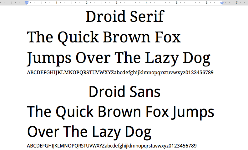
Droid Serif and Droid Sans
Android fans will already be familiar with the Droid family of fonts. Droid Serif and Droid Sans both feature strong vertical lines and a neutral, yet friendly appearance. They’re designed specifically for reading on small screens.

Calibri and Cambria
Every day we have many people import documents from Microsoft Word into Google Docs. Today we’re making import fidelity better by adding two of the most popular Microsoft Word fonts. Calibri is a beautiful sans serif font characterized by curves and soft edges. It’s designed to be high impact. Cambria is built with strong vertical serifs and subtle horizontal ones. It’s very legible when printed at small sizes.

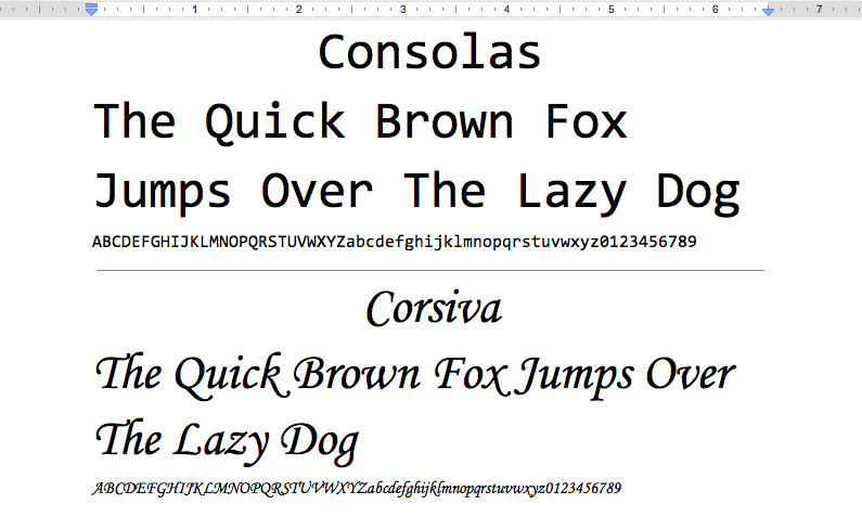
Consolas and Corsiva
Consolas joins Courier New as the second monospaced font in Google Docs. It’s a modern monospaced font with character proportions that are similar to normal text. Finally, Corsiva is our first italic font with embellished characters and an elegant style.

Right now our font support covers most Latin and Western European character sets. However, we’ll be adding web fonts for other languages (like Hebrew and Greek) soon. If you don’t see the new fonts in your documents, check that web fonts are supported in your language and that the document language is set correctly from the File -> Language menu.

This is just the beginning of fonts in Google Docs. We added six new fonts today and we’re already testing our next batch. You’ll see many more new fonts over the next few months. And because Google Docs uses web fonts, you’ll never need to install a new font: when you load your document, the latest set of fonts will always be there, ready to use.
Finally, adding web fonts is just one of the challenges that we have been working on. If you’re interested in learning more about the challenges of building a collaborative application, check out the first post of a three-part series on collaboration posted earlier today.


0 comments:
Post a Comment