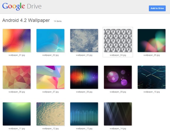
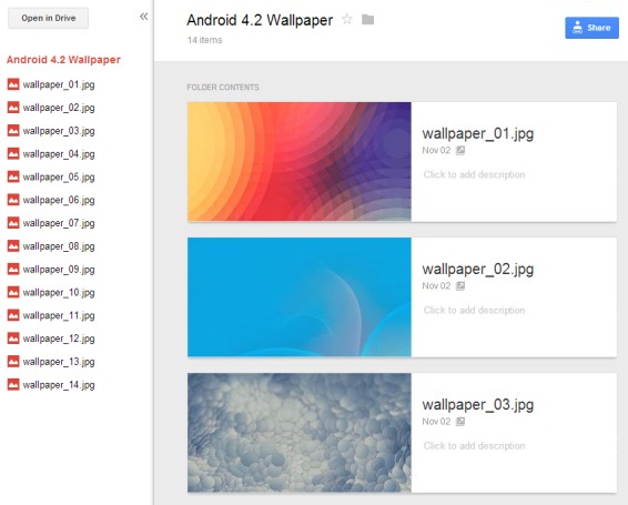
"Over the next week, users who are invited to open a shared folder will notice a much improved visual layout of the folder's contents. You can even click on an item to preview and flip between the content. Want to keep the shared folder? Use the 'Add to Drive' button on the top right to store it directly in your Drive for fast access across all devices," informs Google.
Here's an example of shared folder (Android wallapapers):

And here's the old interface:

You can open any folder in the new interface. Just replace https://drive.google.com/#folders/FOLDERID or https://docs.google.com/folder/d/FOLDERID/edit with https://drive.google.com/folderview?id=FOLDERID, where FOLDERID is a long ID.
The new UI is better suited for quickly previewing files, while the old was great for switching between multiple documents and editing them. Google Drive seems to focus more on consuming content than producing it, a departure from the Google Docs heritage.
I wonder if Google Drive will start to include the photo albums from Picasa Web and Google+ Photos. This would make GDrive less disjointed.
{ Thanks, +Cougar Abogado. }


0 comments:
Post a Comment