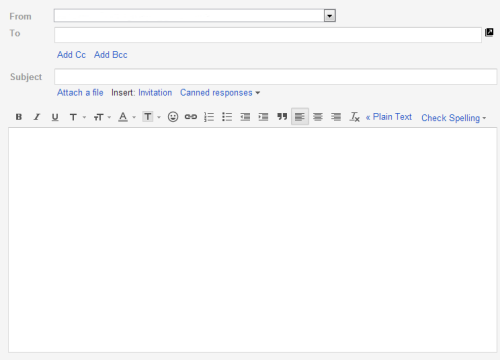
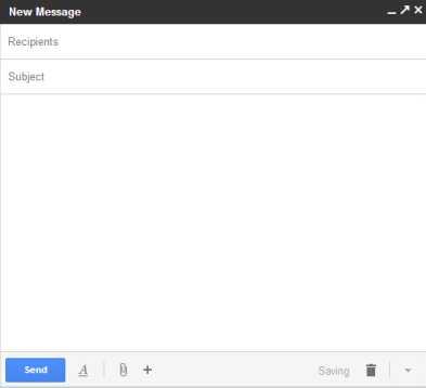
What it looks like, really, is a slightly oversized version of Gchat. And that's no accident. Google's actively trying to make email less fussy and formal--or, in other words, to make it a little more like instant messaging. And as Jason Cornwell, Gmail's lead designer, explains, one of the ways to do that is simply to 'give you permission to write shorter messages.' (...) Picture the standard full-screen compose window. The one that gives you a dauntingly huge text box to fill and an array of options for formatting whatever you manage to put in it. What that really looks like, with its button-strewn toolbar, is an empty word processor--and according to Cornwell, what it communicates to users is this: 'Write something long. It was a space that was sort of intimidating, I think, to write a message like "Hey, wanna get lunch?"' he explains. 'We wanted the new compose to facilitate these quicker messages. Or at least make it a space where that felt appropriate.
Gmail's lead designer says that "a very small percentage of emails involve a formatting action," so that's the reason why you need two clicks instead of only one click to make text bold. Once you click the "formatting options" button, the bar stays open, so you can use other features without an additional click.
Co.Design argues that Gmail now competes with SMS, instant messaging and social networks, so Google had to simplify the interface "to keep up with the times".
The old interface:

The new interface:


0 comments:
Post a Comment